Brand Identity · Corporate Design · Visual Systems
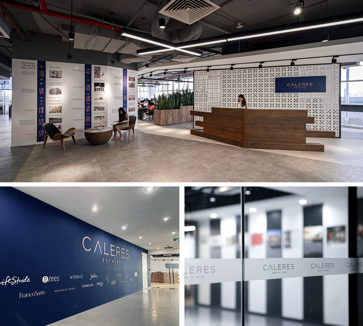
When Caleres CEO Diane Sullivan called for a corporate identity evolution to position the company for its next era, five of the company's top creative directors and art directors from across the portfolio were invited to submit concepts. My winning concept introduced a deconstructed modernism: the roman numeral five embedded within the letterforms themselves, dissolving the separation between wordmark and mark into a single, unified form. What followed was a complete brand standards overhaul that included a new color system rooted in a deeply philosophical idea, the night sky that holds the north star, expressed through a deep expansive blue that replaced the original palette entirely, alongside a new typography system and comprehensive usage guidelines. The identity now spans the company's global infrastructure — from its St. Louis headquarters and offices in Asia and Europe to its investor materials, annual reports, and digital presence worldwide — as the permanent visual foundation of Caleres, Inc. (NYSE: CAL), a publicly traded global footwear company whose portfolio includes Sam Edelman, Stuart Weitzman, and Allen Edmonds.